
How to Design a Real Estate Yard Sign That Actually Gets Calls
 Brian Santos
|
Brian Santos
|
A real estate yard sign has about three seconds to do its job. Someone is driving past at 25 miles per hour, glances at the sign, and either remembers your name and number or keeps driving. That window is the whole game.
Most real estate sign designs fail because they treat the sign as a business card. Too much information, too many fonts, a logo sized for a laptop screen, a phone number buried in small text at the bottom. Agents who consistently get calls from their custom real estate signs design for the glance, not the stare.
This guide covers what actually works when you design a sign to drive calls, not just look nice.
Design for the 3-Second Drive-By, Not the Close-Up View
The most common real estate sign design mistake is designing the sign on a computer screen. It looks great at 100% zoom. Then it goes in the ground and nobody can read it from the street.
Before any design decision, ask one question: can someone driving past at normal neighborhood speed read the headline, catch the phone number, and remember your name in under three seconds? If not, the design is not working, no matter how polished it looks.
Prioritize Readability Over Aesthetics
Readability is the difference between a sign that generates calls and a sign that sits in the yard looking professional and doing nothing. The three factors that control readability from a distance are font size, contrast, and whitespace.
A good rule of thumb for an 18x24 inch yard sign: the headline text should be readable from 50 feet away, and the phone number should be readable from 30 feet. If you print a full-size test sheet and hang it on a wall, you can walk backward and check this in about two minutes.
Build a Clear Visual Hierarchy
Hierarchy tells the eye where to look first, second, and third. On a real estate yard sign, the ideal order is:
-
Headline first. Usually "For Sale," "Just Listed," or "Open House." This is the biggest element on the sign.
-
Phone number second. Large, bold, and easy to read while sitting at a red light.
-
Agent name and brokerage third. Present but not competing with the phone number for attention.
-
Everything else fourth. QR code, tagline, website. These are supporting details, not the main event.
When every element fights for the same visual weight, the sign looks busy and nothing stands out. A hierarchy makes the sign scannable in the way a driver needs it to be.
What to Put on a Real Estate Sign to Actually Drive Calls
Here is a quick breakdown of what belongs on a sign, how big each element should be, and what it does for the viewer.
|
Element |
Recommended Size |
Purpose |
|
Headline (For Sale, Just Listed, etc.) |
Largest text on sign |
Signals action at a glance |
|
Phone number |
Second-largest, bold |
Primary call driver |
|
Agent name |
Medium, clear font |
Builds personal recognition |
|
Brokerage name or logo |
Small to medium |
Trust signal and compliance |
|
QR code (optional) |
2 to 3 inches square |
Captures foot traffic and curious neighbors |
|
Website (optional) |
Small |
Backup contact for those who prefer digital |
Anything beyond this list competes with the elements that actually drive calls. If you are tempted to add property details, price, square footage, or a list of features, those belong on a flyer or the listing page, not on the sign itself.
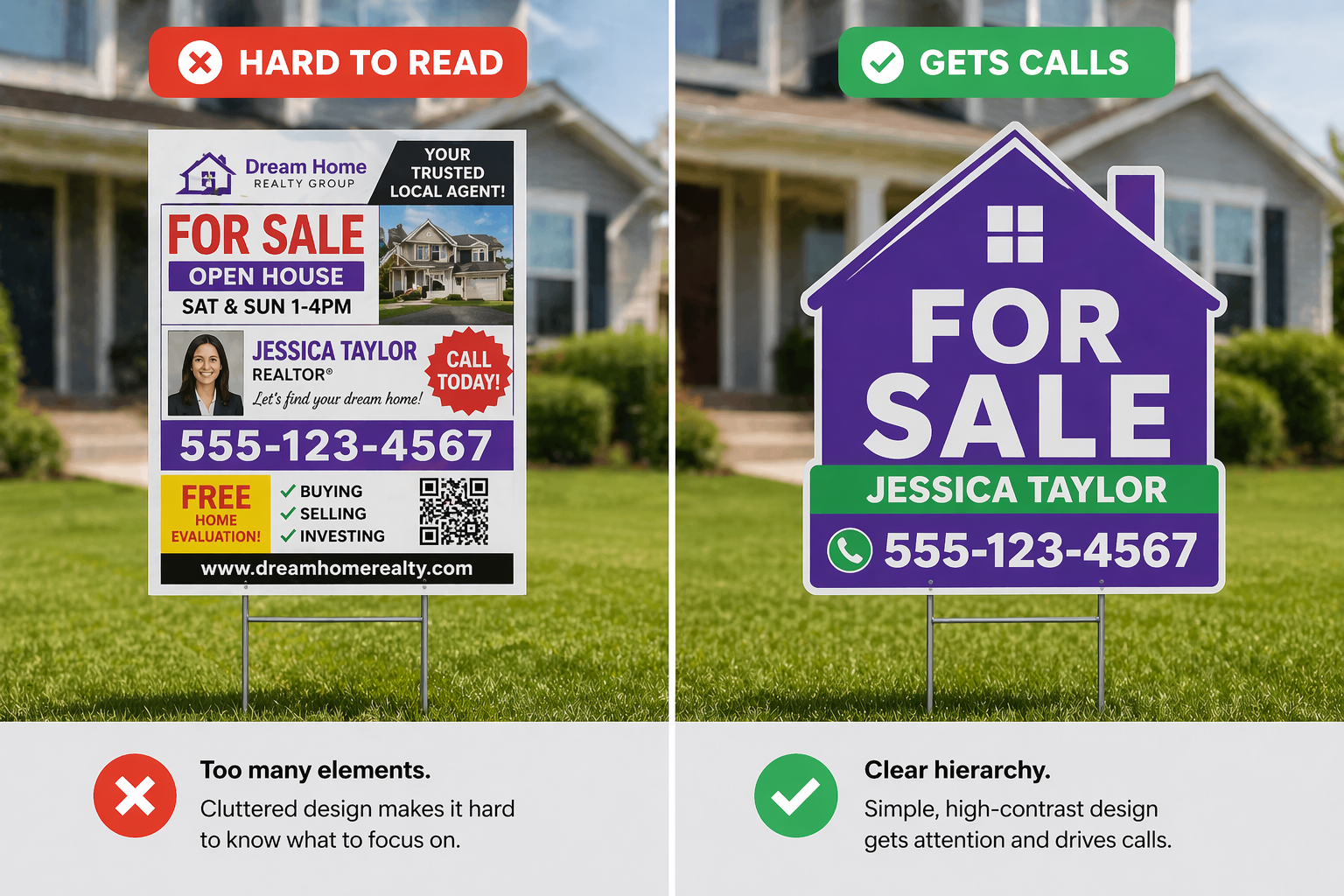
High-Contrast Real Estate Sign Colors That Hold Up Outdoors
Color is where most DIY real estate sign designs fall apart. A color palette that pops on a backlit monitor can wash out completely in direct sun. The signs that hold up outdoors follow a few simple rules.
Use High-Contrast Color Pairs
The strongest color combinations for yard signs are the ones with the highest contrast between text and background. Black text on white, white text on navy, white text on red, and black text on yellow all read well from a distance and in direct sunlight.
Low-contrast combinations like gray on white, tan on cream, or light blue on white disappear in bright light and at distance. They may look sophisticated on a screen, but they fail the 3-second test in the yard.
For a deeper look at what colors work best in the field, see our guide on the 10 best colors for yard signs.
Stick to Two or Three Colors Max
More colors rarely help a real estate sign design. Two or three colors covering background, text, and one accent keeps the design clean and directs attention where you want it. Every additional color dilutes the visual hierarchy.
Branded agents often use their brokerage colors as the starting point, then add a high-contrast text color on top. If your brokerage colors are low contrast with each other, use one as an accent only and pick a stronger pairing for the main text.
Real Estate Sign Fonts That Read Clearly From the Street
Font selection is not the place to show off design range. A real estate yard sign needs one or two fonts at most, both chosen for legibility at distance.
-
Sans-serif fonts like Helvetica, Arial, or Montserrat read best from distance. Their clean letterforms hold up in sun and at speed.
-
Bold weights outperform regular weights on outdoor signs. Thin fonts disappear against busy backgrounds like foliage or brick.
-
Avoid script and decorative fonts for anything except small accent elements. Even then, use sparingly.
For more on font pairing and what reads well at sign distance, see our breakdown of the best fonts for yard signs.
Design Mistakes That Kill Real Estate Sign Performance
A few patterns show up over and over on signs that underperform. Knowing them upfront saves a reprint.
Cramming Too Much Information
A real estate sign is not a listing sheet. When a sign tries to list the price, square footage, bedroom count, open house time, agent name, brokerage name, phone number, website, QR code, and a tagline, none of those elements get the space they need to register. The phone number gets lost in the crowd, and the call never happens.
If you find yourself adding a fifth element, remove two.
Using a Low-Resolution Logo
Brokerage logos are often provided as low-resolution files or shrunk down from a web header. When blown up to sign size, the edges get jagged and the whole sign looks unprofessional. Always use the highest-resolution version of the logo available, and size it appropriately for the sign rather than forcing it to a specific inch measurement.
Phone Numbers That Are Hard to Read
The phone number is the second most important element after the headline. It should be bold, large, and broken into chunks with dashes or dots that make it easy to remember at a glance. A phone number rendered in a decorative font, tucked into a corner, or styled in a light color is a phone number that does not get dialed.
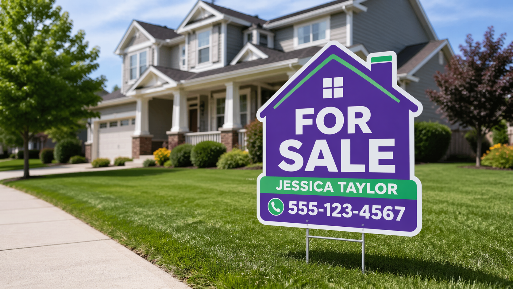
How Custom Die-Cut Real Estate Signs Stand Out From Rectangles
Most real estate signs on any given street are standard 18x24 rectangles. That uniformity is why custom die-cut real estate signs outperform rectangles in recall and brand recognition. When every other sign on the block is a rectangle, a house-shaped or key-shaped sign stops the eye.
At Yard Sign Plus, our Giant Key Signs are a popular die-cut option for real estate. The shape doubles as a symbol for the transaction itself, and it photographs well for social media posts and marketing materials. Agents often find that a custom-shaped sign becomes a recognizable part of their personal brand in the neighborhoods they work.
Die-cut signs cost slightly more per unit than standard rectangles. For agents who are building a recognizable brand across multiple listings, the visibility and recall usually justify the difference.

How Yard Sign Plus Helps Realtors & Agents Design for Sales
Real estate agents order with Yard Sign Plus because the process is built around fast turnaround and free design help, not upsells.
-
Free design support on every order. Upload your logo and contact info, and our design team handles layout, contrast, and hierarchy.
-
Proofs in one hour, so you can adjust sizing, color, and typography before production starts.
-
4mm corrugated plastic with UV-resistant inks, so signs hold their color through a full listing cycle outdoors.
-
No minimums, no setup fees, no design fees. Order one sign or a hundred. The price you see at checkout is the price you pay.
-
Die-cut options including Giant Key Signs for agents who want to stand out from standard rectangles.
For agents building a consistent look across listings, ordering in bulk lowers the cost per sign and gives you backup stock for last-minute listings. See our bulk yard sign pricing guide for how quantity tiers work.
Ready to Design a Realtor Yard Sign That Gets Calls?
Start with the three-second test. Headline, phone number, name. Build outward from there, keep contrast high, and pick a shape that stands out from every other rectangle on the block.
Get your free proof in under 1 hour. Shop real estate yard signs at Yard Sign Plus.


Leave a Comment